
Classifications
8 Sans Serif
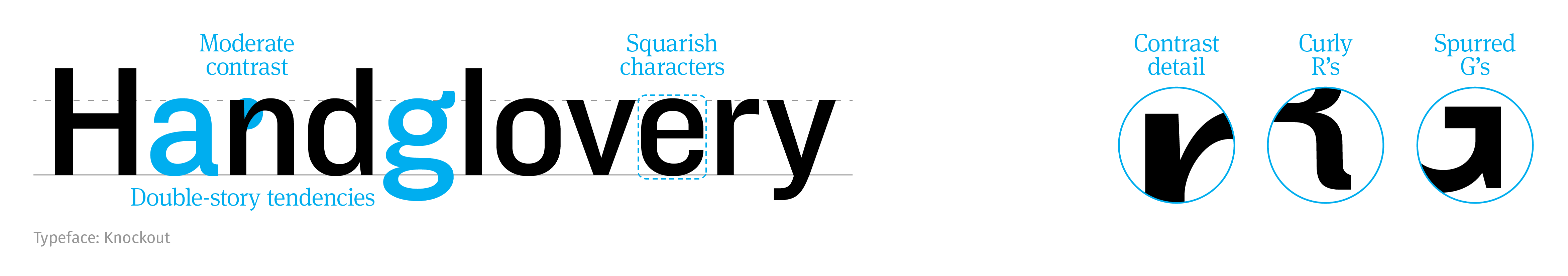
Grotesque (late 1800’s)
Early sans serifs with a tendency toward peculiarity. Named after their perceived ugliness at the time when compared against serifs (e.g., Didone). Characterized by the tendency toward double-storied a’s and g’s, moderate contrast, squarish shapes, and spurred Gs.
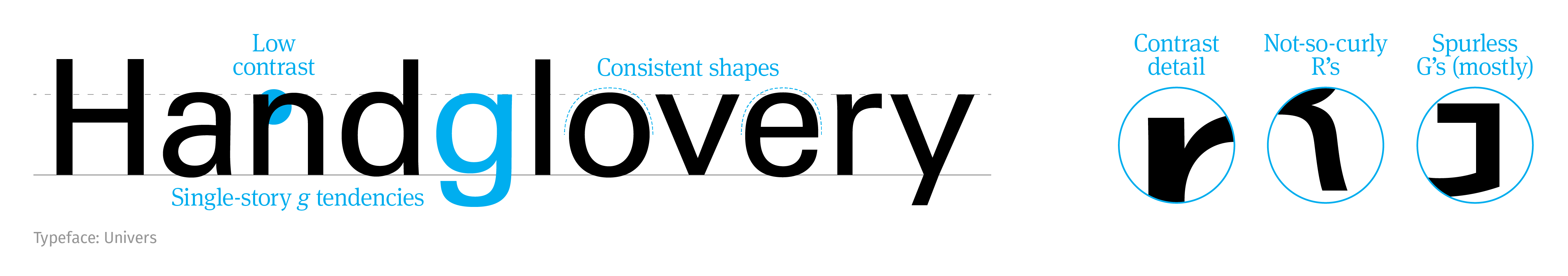
Neo-Grotesque
These were developed for simplicity and legibility. They are also the first typeface families with width and weight variations. Characterized by low contrast, single-story g’s, consistency in shape, and mostly spurless G’s.
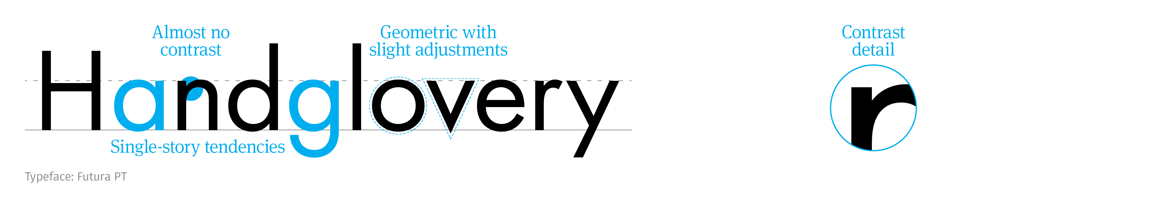
Geometric
Inspired by industrial methods, these typefaces use repetitive, simple shapes, sometimes with proportional variations. Characterized by single-story a’s and g’s, almost no contrast, and geometric shapes.
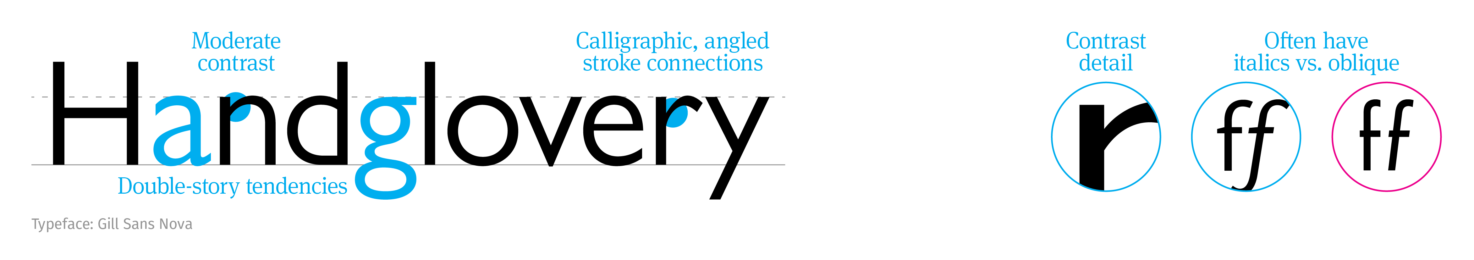
Humanist
Like Humanist serifs, they are based on natural letterforms. These work better for longer body text than the other sans serifs. Characterized by double-story a’s and g’s, moderate contrast, calligraphic stroke connections, and true italics vs. oblique.
Comparison
Developed in the late 1700’s – early 1800’s, technology advanced enabled typographers to push the limits of typeface refinement. Characterized by extreme contrast, thin serifs, vertical axis, and no serif brackets. See the serif classification.
The difference in weight between the thickest and thinnest strokes in a typeface. Related to axis and stress. See anatomy.
Also called humanes. Earliest serif typeface classification, it was based on calligraphic writing with flat brush or broad nib pen. Developed between the 1470’s – 1490’s. Characterized by small x-height, low contrast, angled serifs, a strong axis, an angled cross stroke on the e, and generous serif brackets. See the serif classification.
Cursive letterforms completely redrawn from the regular style, primarily used for emphasis. See common characteristics.
Slanted or skewed letterforms in an attempt to mimic italics. Common among sans serif typefaces. See common characteristics.
