The basics
3 Common characteristics
Typefaces come in a wide range of shapes and sizes, but there are a few core characteristics that are common among most typefaces. You’re likely already familiar with most of these, but possibly not the extent to which these characteristics are changed in some typefaces.
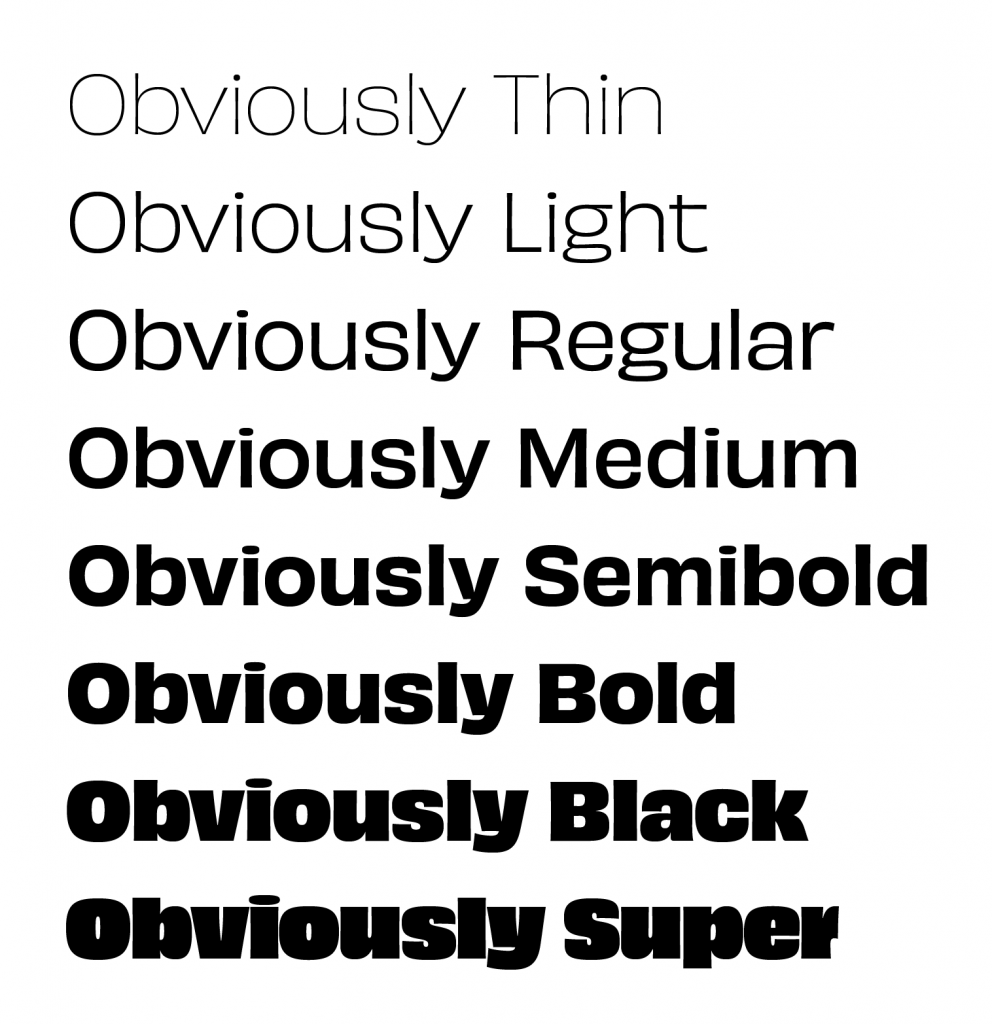
Weight
The thickness of a character relative to its height. Regular/book are used for text type. Lighter/heavier weights are used for emphasis or headline/display type. Most typefaces only have Regular and Bold, but some, like this example, have a broad range of weights.
Slope
These are the italic and oblique styles and are often used for emphasis. Italics are cursive letterforms completely redrawn from the regular style, while oblique is simply a typeface that has been placed on an angle or skewed. Oblique is less desirable but you may have difficulty finding an italic style with sans serif typefaces.
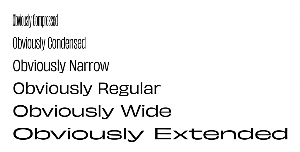
Width
Fairly self-explanatory: these are the different widths a typeface can have. Don’t use anything but a regular width for text type because narrow/wide variants typically have reduced legibility. Not every typeface has multiple widths but trying different widths can be a great way to bring visual interest to a headline.
Quiz
The symbol that represents a letter (e.g., an uppercase E). See clarifying confusing terms.
Anything set between six and 14 points is considered text type. See frequently used terms.
Anything set above 14 points is considered display type. See frequently used terms.


